01 / AVO FRUITY
One brand.
Six personalities.
Packaging Design · Product Visual Direction · Product Typography
My role
A clearer system for a more expressive range.
AVO Fruity provided the existing AVO logo. My role was to develop the packaging direction around it — making the range clearer, more expressive and more competitive while keeping one recognizable family.
The thinking
One brand. Different personalities.
Rather than forcing every product into one identical visual treatment, I gave each flavour a distinct personality through typography, colour, ingredient cues and small visual ideas — while keeping the AVO identity consistent across the range.
Clarity
Make the product and its contents immediately understandable.
Appetite
Use colour, texture and product cues to make the packaging desirable.
Personality
Give every variant a memorable reason to be noticed.
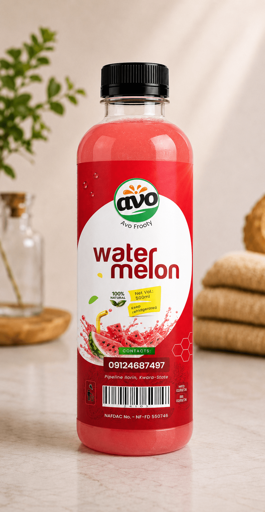
Watermelon
A hidden idea in plain sight.
The straw becomes part of the wordmark itself. It is subtle enough to read naturally, but once noticed, the second straw becomes obvious — a small piece of visual strategy designed to reward attention.
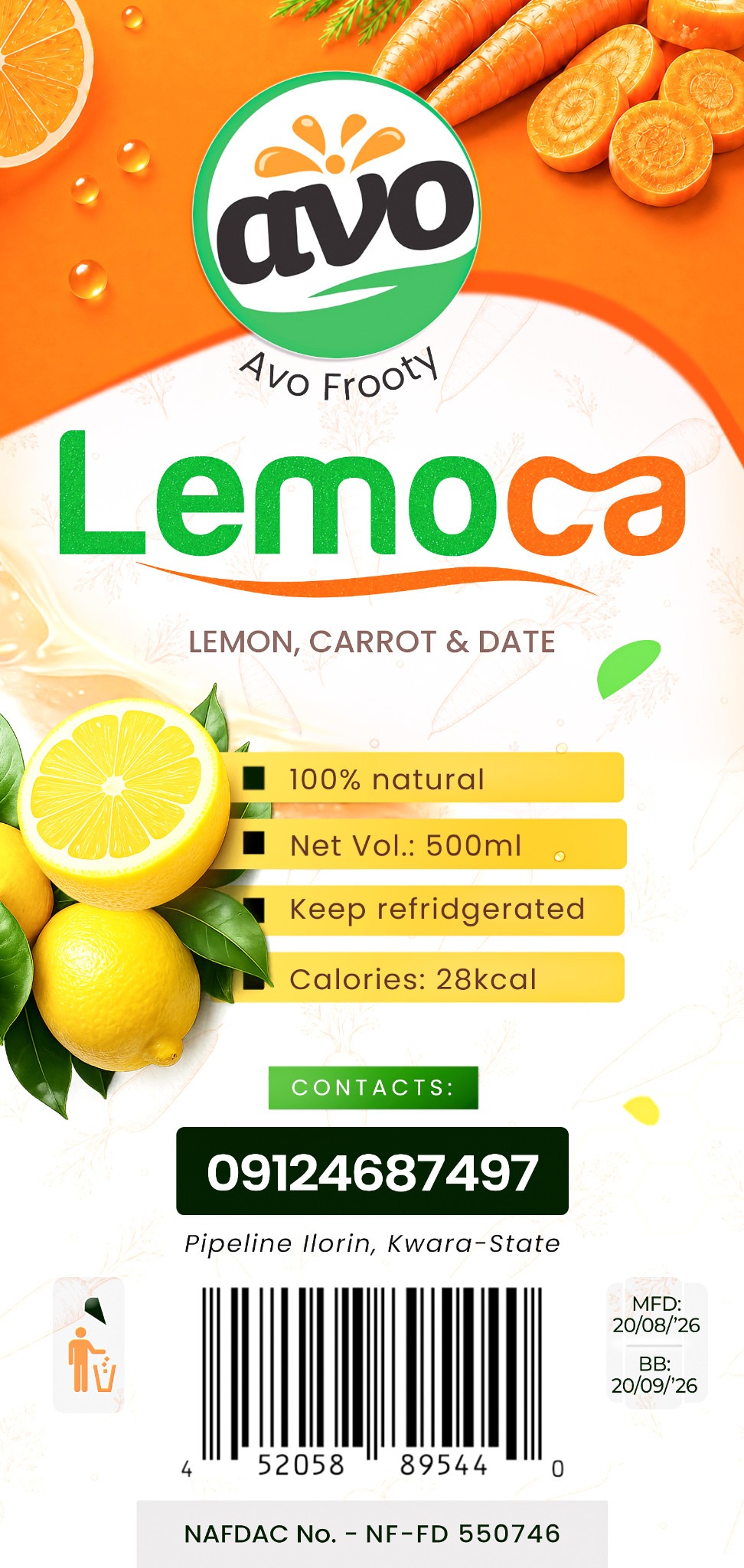
Lemoca · Sticker artwork
The ingredients influence the personality.
Lemon, carrot and date are reflected directly in the colour and movement of the typography. The green-to-orange wordmark and flowing underline make the product feel fresh, energetic and ownable.
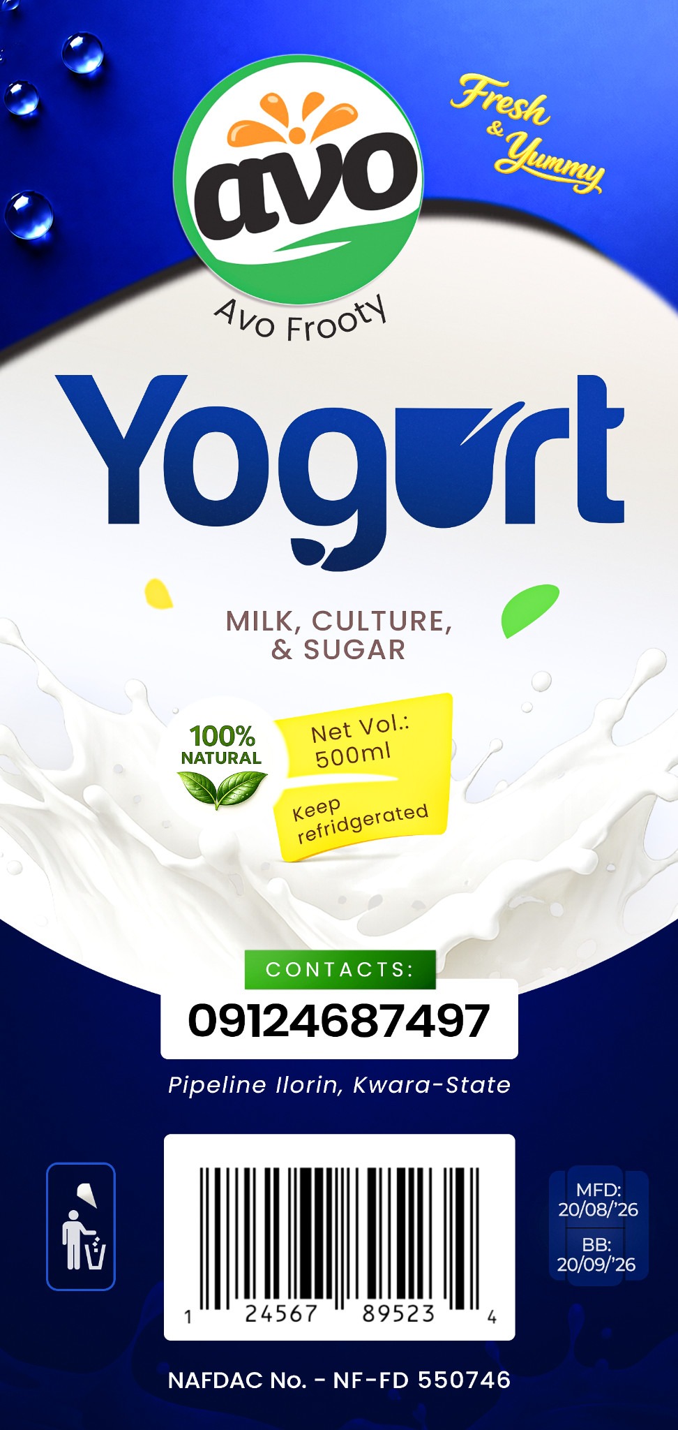
Yogurt · Sticker Artwork
The product becomes part of the design language.
The cup-and-straw idea gives Yogurt a playful signature. Blue and white strengthen the dairy association, while the typography keeps the product connected to the wider AVO family.
The range
Same family. Different character.
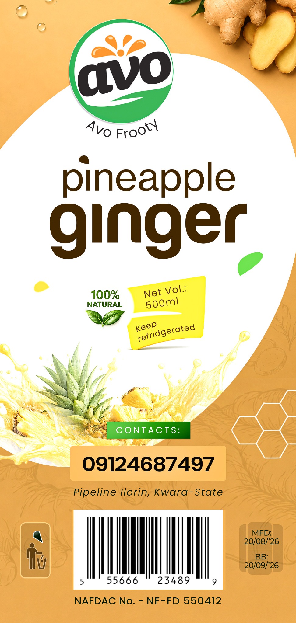
Product communication
Information, arranged to support the story.
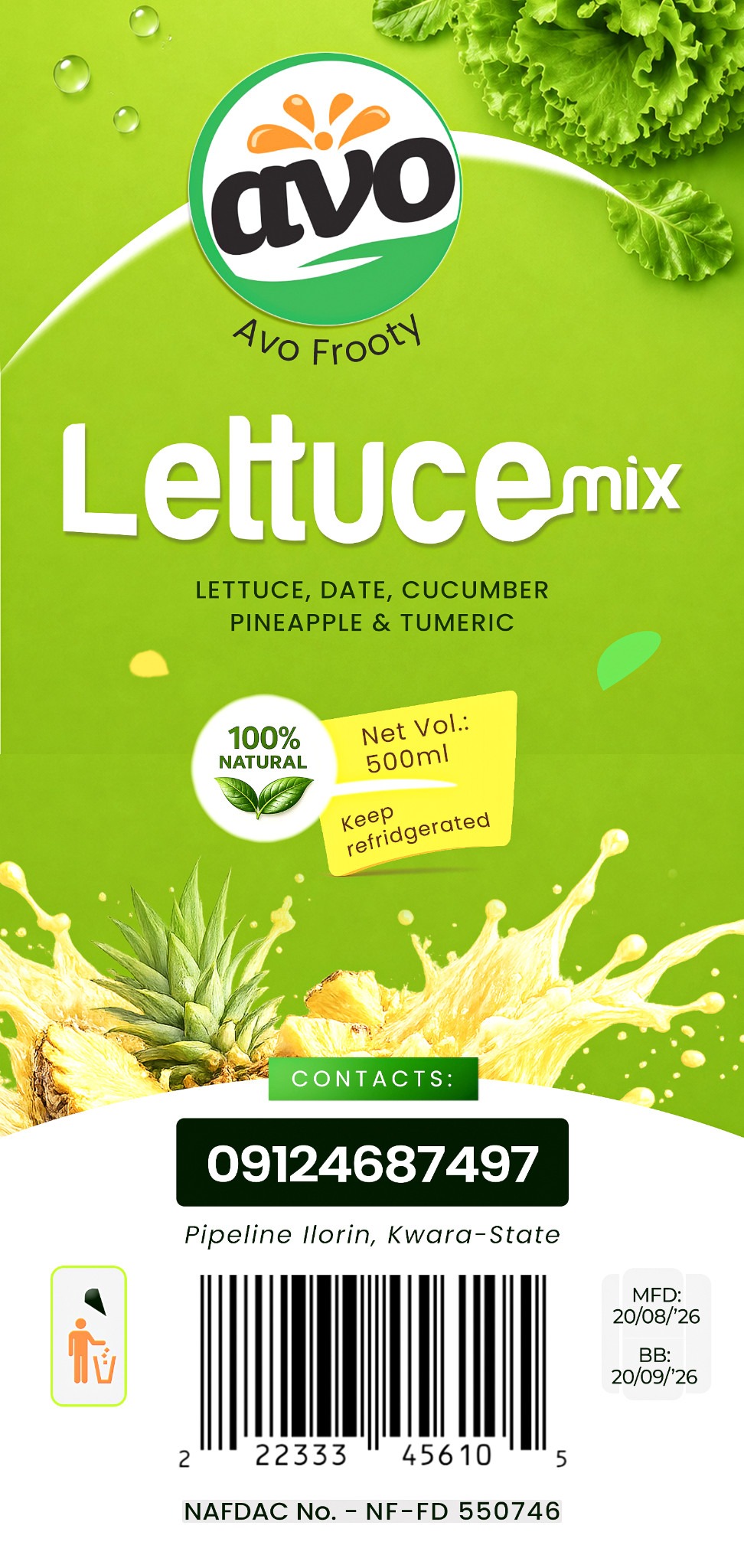
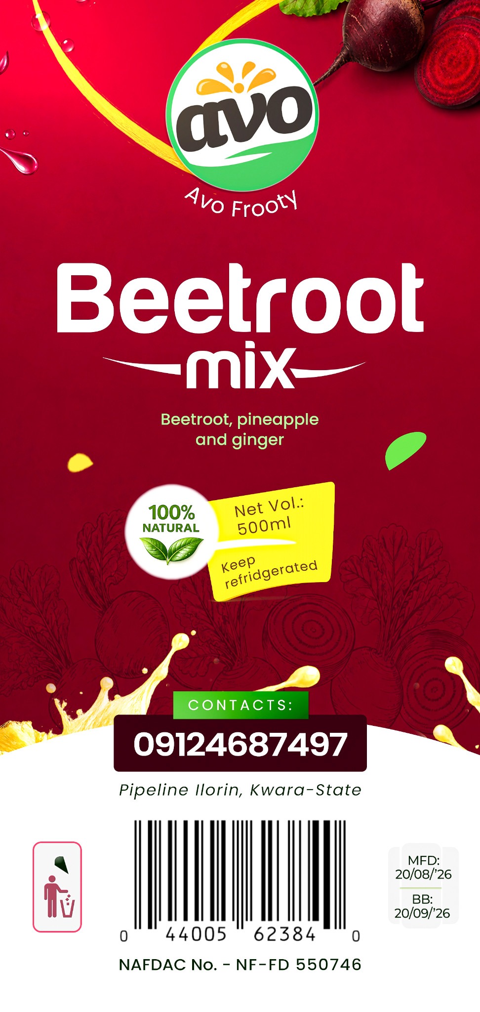
The packaging balances the hero product story with the information a customer needs: ingredients, natural positioning, net volume, storage instructions, contact details, dates, barcode and regulatory information.
The result
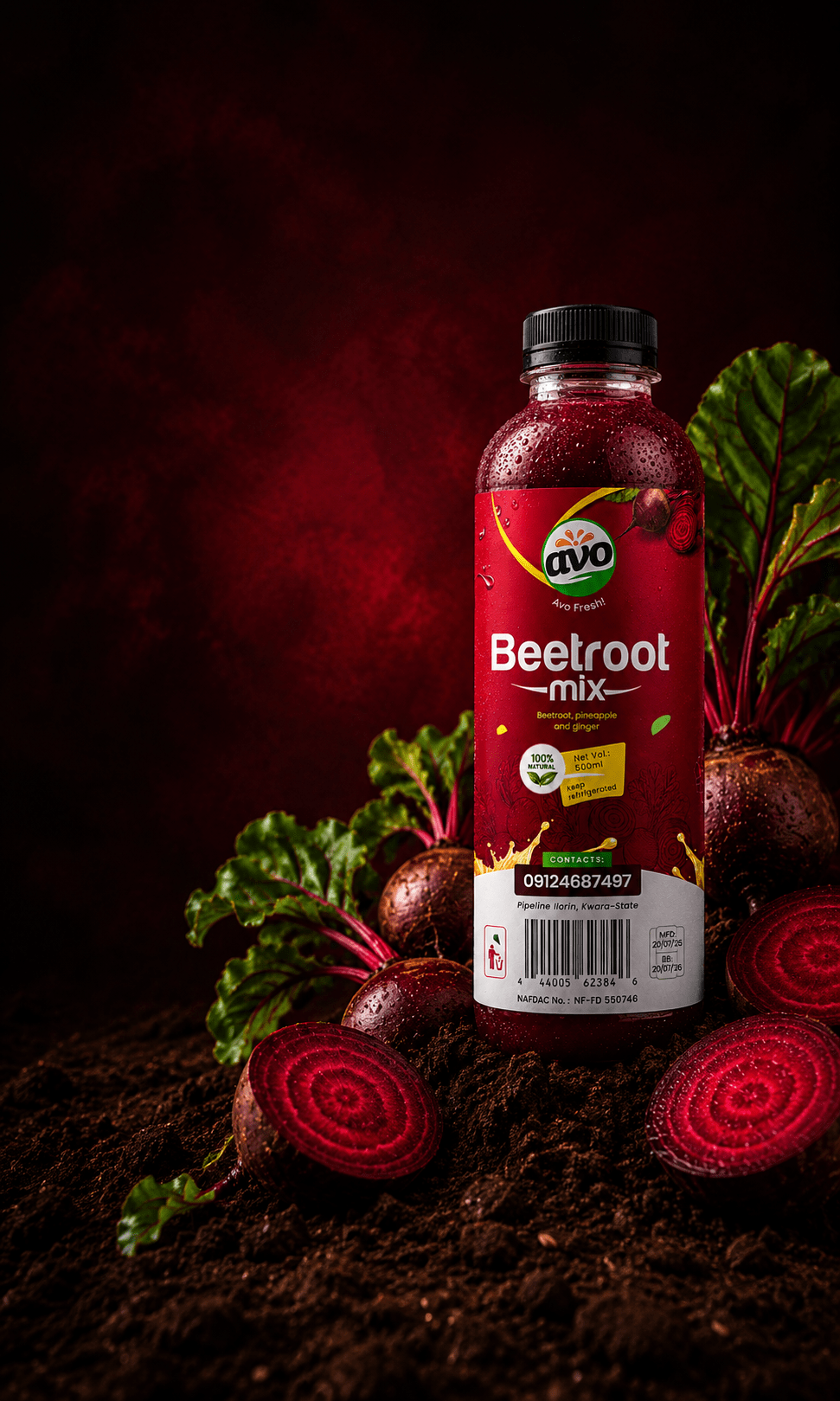
A product range with one recognizable voice — and six reasons to look twice.
The result is a more distinctive AVO Fruity shelf presence: connected enough to feel like one brand, expressive enough for every product to have its own character.