Recognition
Keep the parent brand unmistakable at every touchpoint.
Packaging · Brand Application · Product Direction
01 / Foundation
The opportunity
The challenge was bigger than a single pack. The system needed to move naturally between milk, yogurt, flavour, photography and future extensions — without losing the recognition built into the Minalait identity.
Keep the parent brand unmistakable at every touchpoint.
Give product information a clear visual priority.
Let flavour and imagery add emotion without breaking the system.
Build rules that can support the next product too.
02 / Object intelligence
Bottle / physical constraint
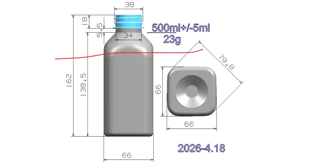
Structure before styling
The physical bottle defines proportion, shoulder, neck, cap and printable area. Treating those constraints as part of the creative process makes the final packaging feel intentional in three dimensions.
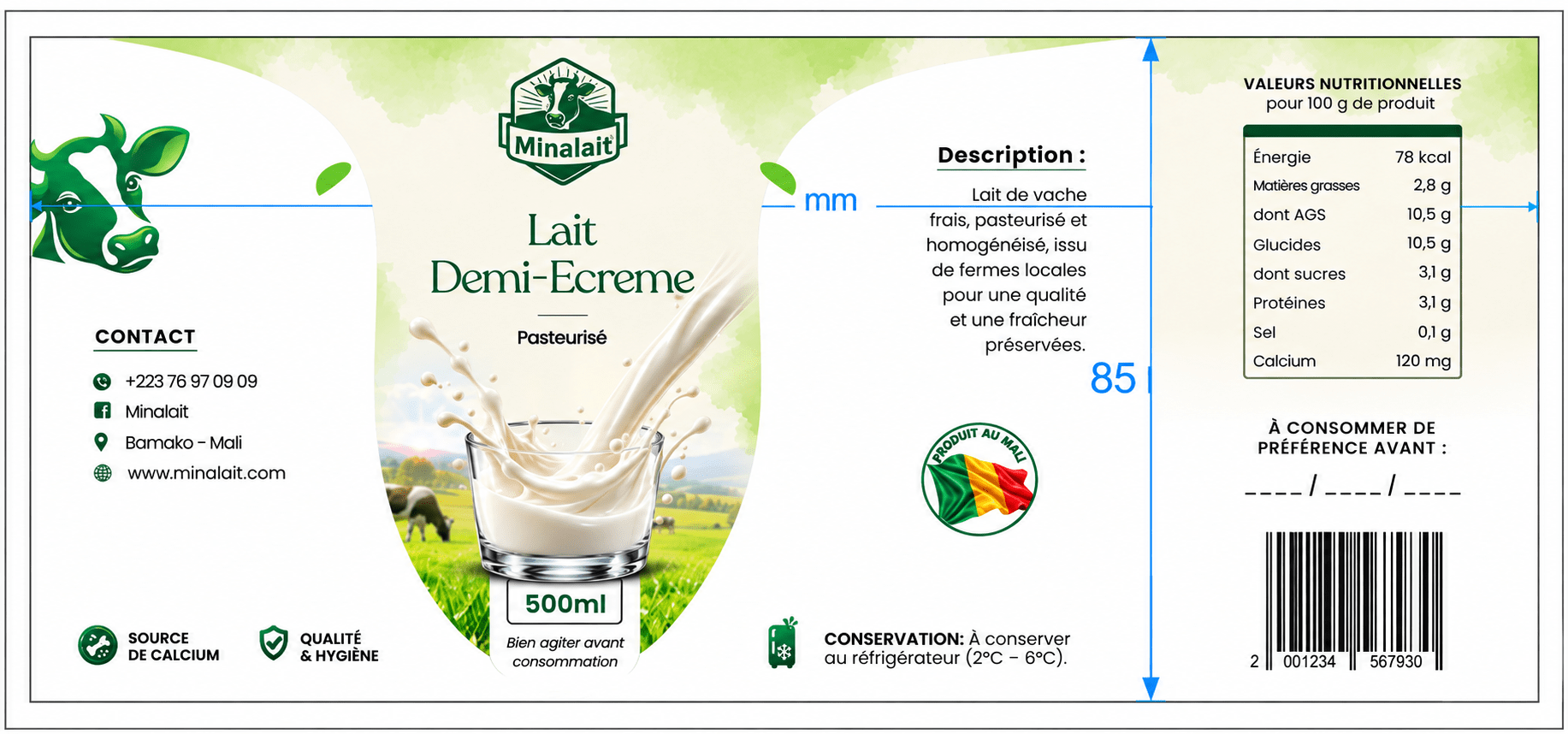
The design has to survive the wrap. Hierarchy, typography and information architecture are considered before the artwork becomes a physical object.
04 / Milk system
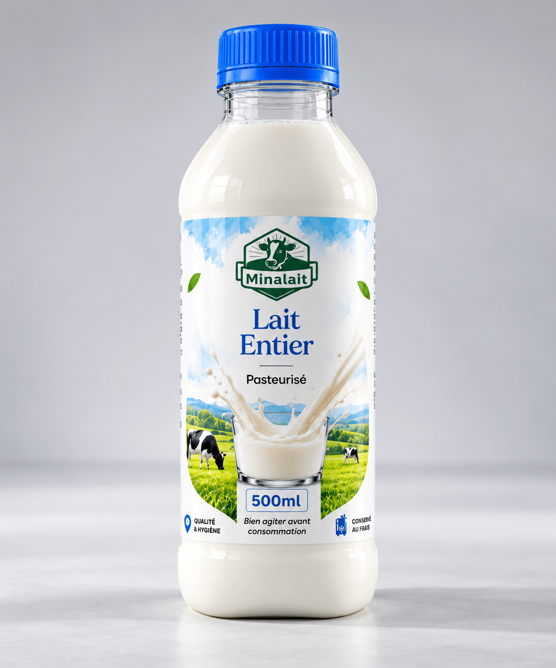
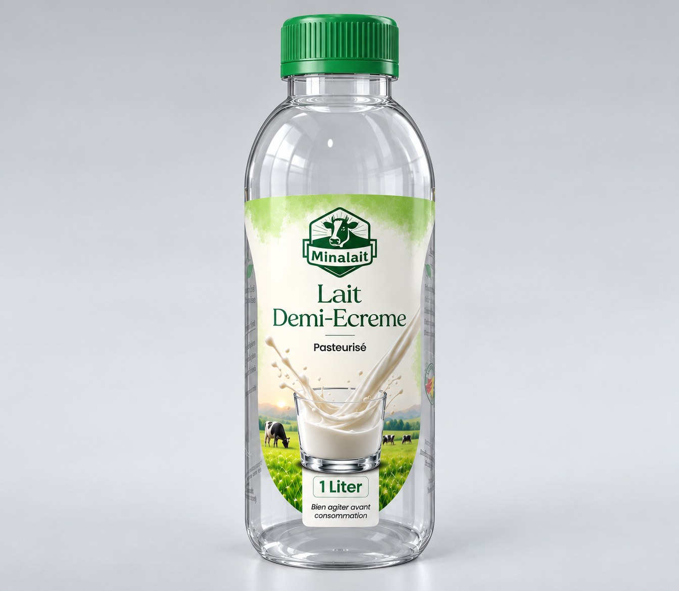
The milk range uses restraint as a strength: a recognisable brand, clear product hierarchy and imagery that lets the product feel premium without shouting.
Lait Entier / 500 ml
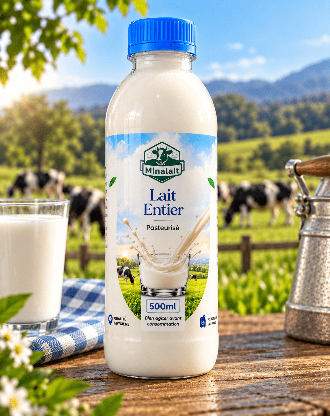
The lifestyle image becomes part of the identity rather than an afterthought — bringing the dairy story out of the pack and into a wider product world.

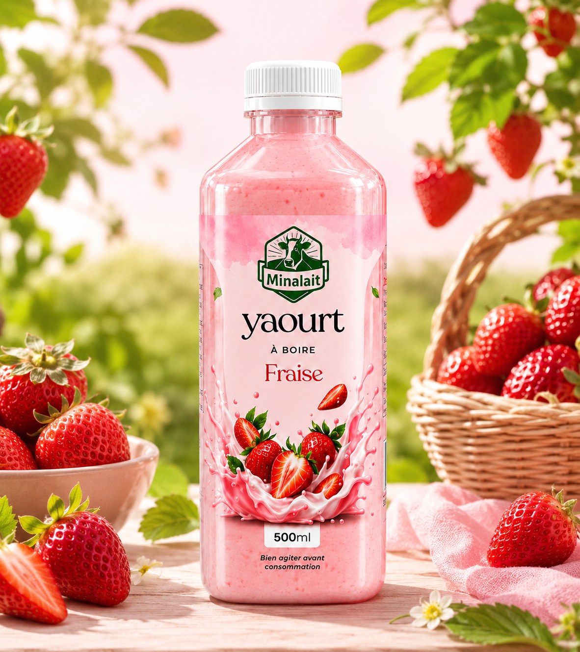
The variable is flavour. The constant is Minalait. Each yogurt variant can express its own appetite while still belonging to the same family.
Nature / 01
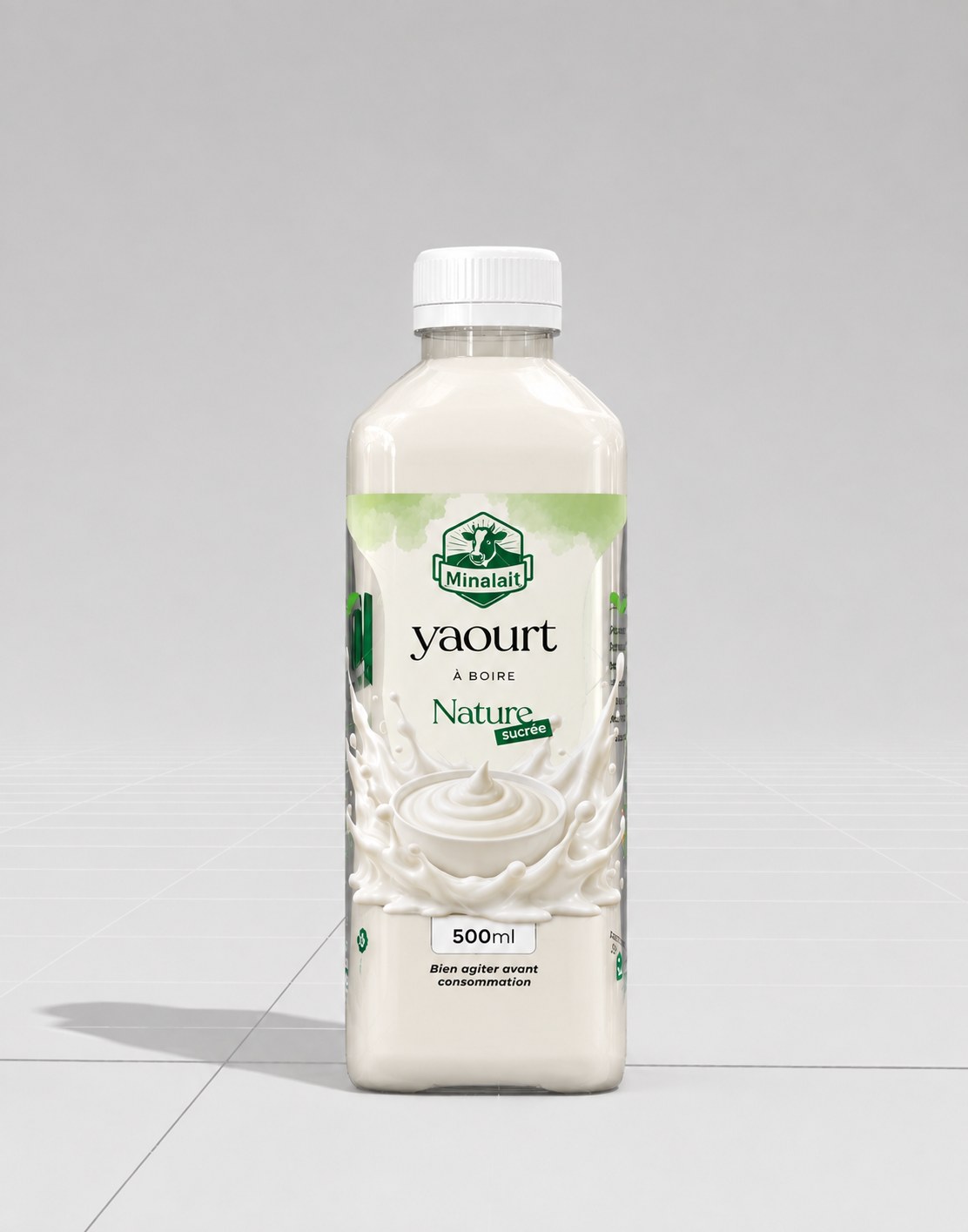
Y / 01
Fraise / 02
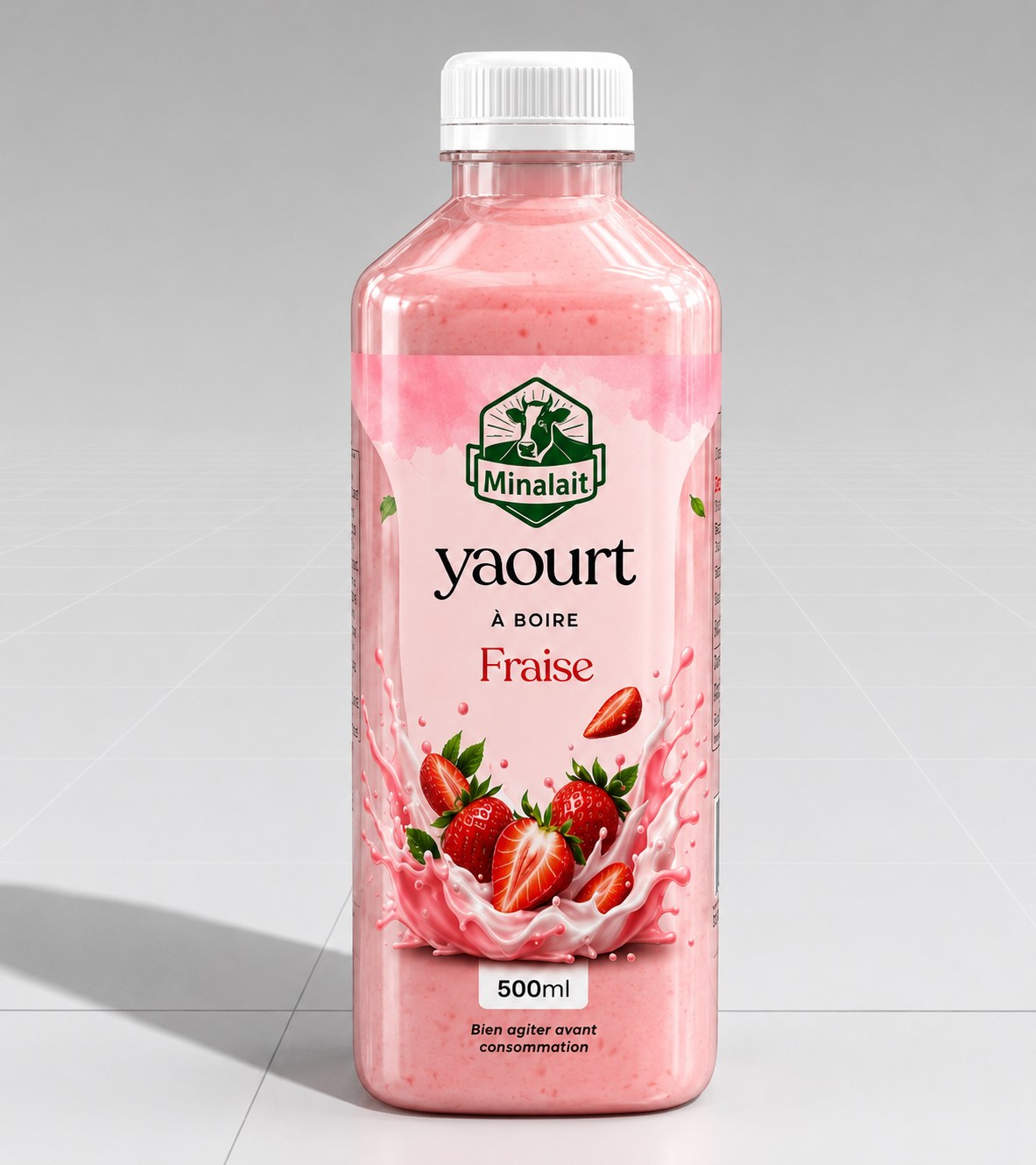
Y / 02
Vanille / 03
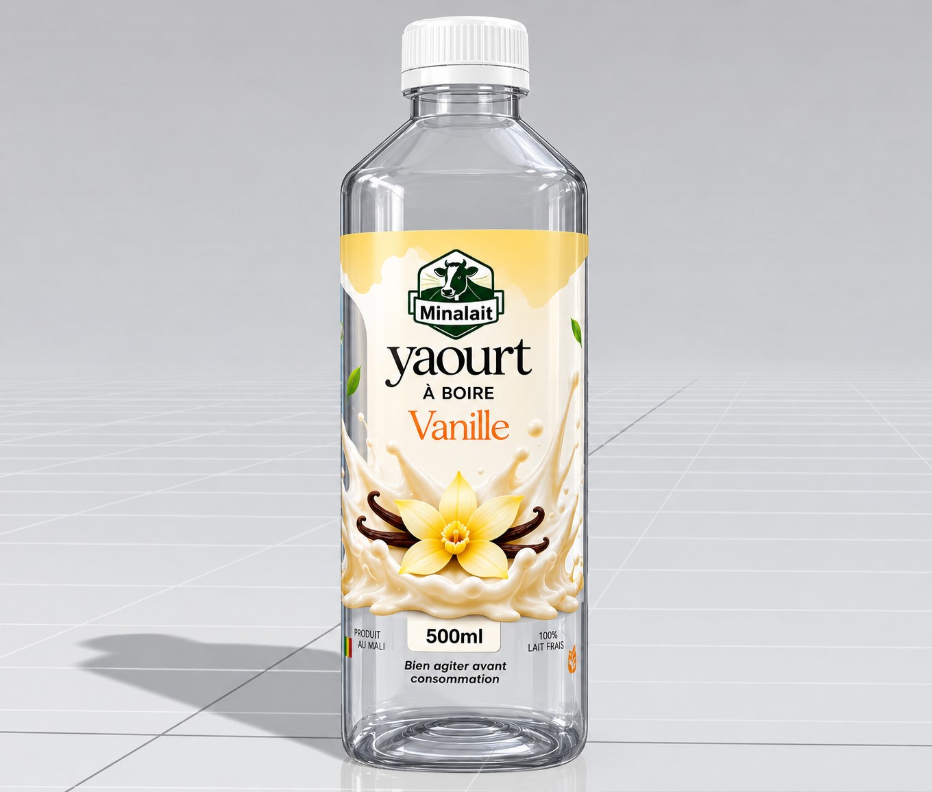
Y / 03
06 / Flavour signal
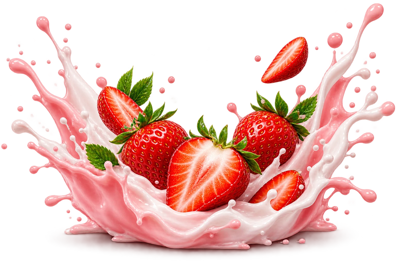
For Fraise, the strawberry is not a decorative extra. It becomes a sensory bridge between packaging and appetite — a visual cue that gives the flavour its own energy.
07 / Product world
Once the architecture is stable, the brand can move beyond the bottle. Photography, atmosphere and product cues create a world around the range — giving the identity somewhere to live.
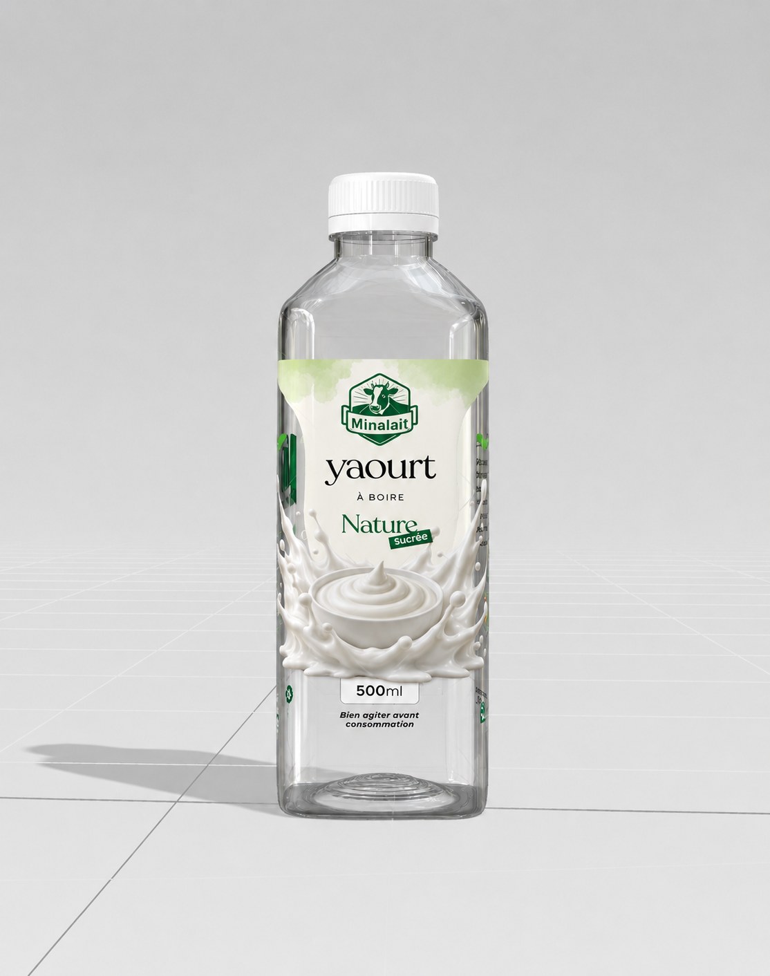
A clear bottle introduces the environment as a design variable. Liquid, light, label and background begin to share one canvas.
09 / Motion
A packaging system becomes a richer digital experience when framing, product cues and rhythm are allowed to move.
10 / The result
The final direction connects identity, physical structure, packaging, photography and motion into one coherent visual language — disciplined enough to scale and expressive enough to be remembered.
Giftednuel / Minalait
The real asset is not one beautiful pack. It is the system behind it — a visual language capable of carrying the brand into its next chapter.
← Exit case study