Giftednuel
REDDEW
01
01 / The Brand Natural Hibiscus Beverage

A brand rooted in nature.

REDDEW
RETURNS
TO NATURE.

RedDew visual identity
REDDEW / 001 IDENTITY STUDY
NATURAL • DISTINCTIVE • EXPRESSIVE •

RedDew is a natural hibiscus-based beverage created to bring the familiar taste of nature into a more contemporary visual world.

The challenge was not simply to create an attractive identity. It was to give the brand a visual presence capable of standing confidently on shelf, connecting with consumers and remaining unmistakably natural.

DISCIPLINE Brand Identity
INDUSTRY Beverage
ROLE Creative Direction
THE IDEA
02
02 THE IDEA
NATURE / BUILT INTO THE NAME
THE CREATIVE IDEA

A LEAF, INSIDE THE D.

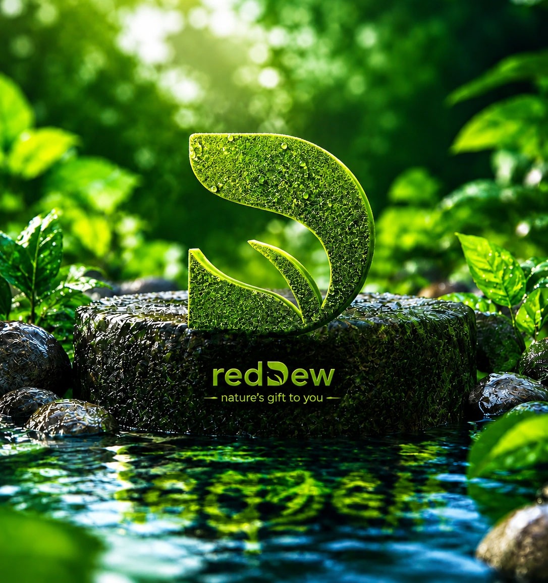
Rather than placing nature around the brand, the idea was to make nature part of the brand itself.

01
THE NAME

REDDEW was the foundation. The identity needed a simple visual connection to nature.

RedDew leaf concept
RedDew D concept
LEAF / D
RED / 01 ORGANIC FORM D / LEAF
02
THE LEAF

A leaf was incorporated into the D—turning a single letter into a quiet expression of nature.

THE CORE IDEA

Nature wasn't added to RedDew. It became part of the name.

WHY IT WORKS

One simple gesture turns the wordmark into a story.

The leaf gives the identity an immediate connection to nature while remaining subtle, memorable and intrinsically connected to the RedDew name.

FROM IDEA
03 THE IDENTITY
03
03 / THE IDENTITY
THE IDEA / MADE DISTINCTIVE
THE RESULT

NATURE,
MADE DISTINCTIVE.

The leaf and the D converge to form a mark that feels natural, expressive and unmistakably RedDew.

REDDEW / 001
FINAL MARK
ORGANIC FORM
RED / 01
LEAF D REDDEW
THE IDENTITY
A simple organic form,
with a story built in.
04
04 / THE VISUAL LANGUAGE
REDDEW / CASE STUDY
THE VISUAL LANGUAGE
04.00
IDENTITY EXPRESSION

FROM IDENTITY TO EXPRESSION.

VISUAL LANGUAGE / 01

The identity moves beyond the mark into a visual world built around product, energy and expression.
PRIMARY EXPRESSION 04 / 01
RedDew visual language
REDDEW / EXPRESSION
01
PRODUCT / EXPRESSION
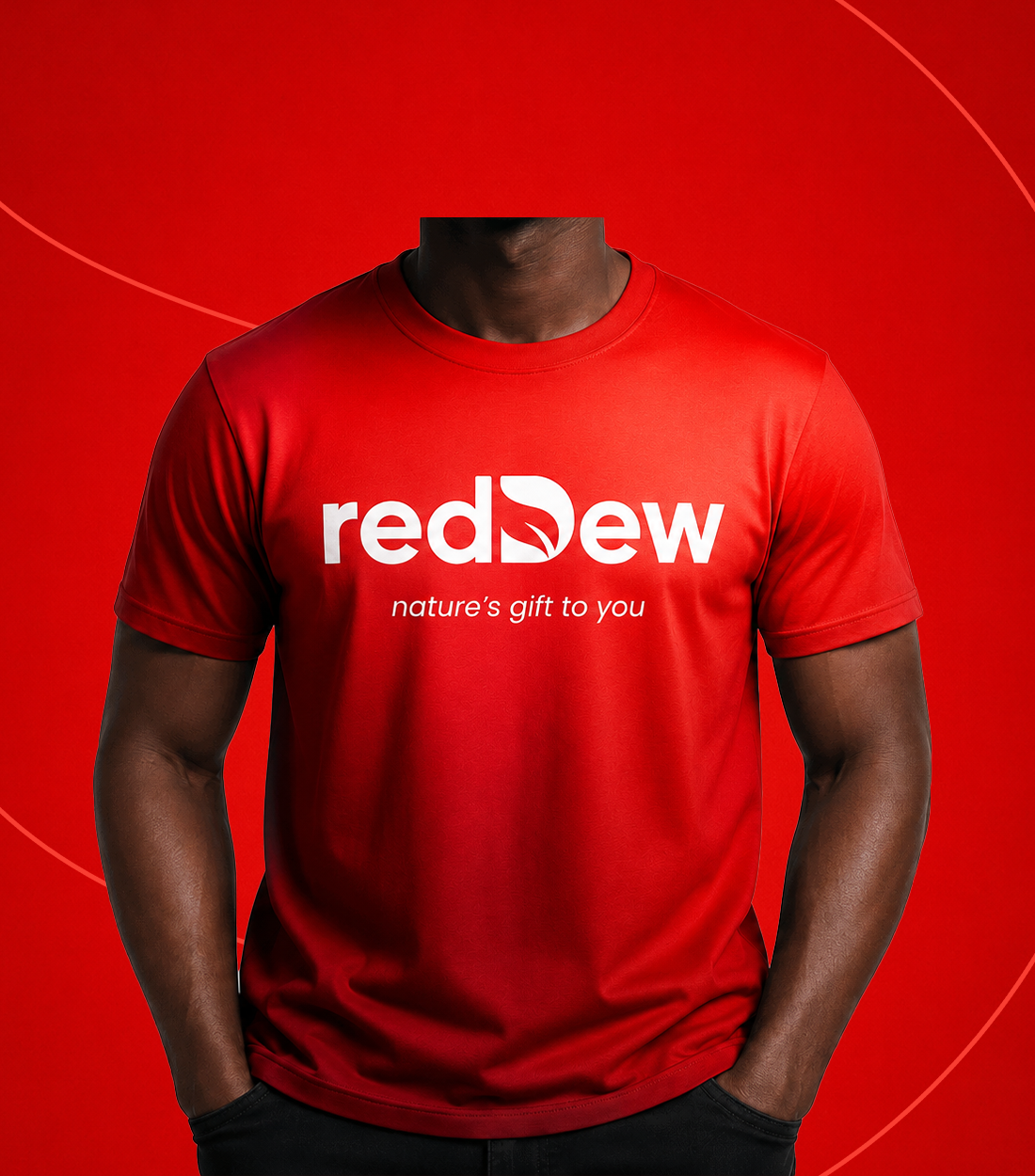
A visual language built to make the product felt.
VISUAL PRINCIPLE
Nature gives the identity its character. Expression gives it its presence.
01 NATURE
04 / 02
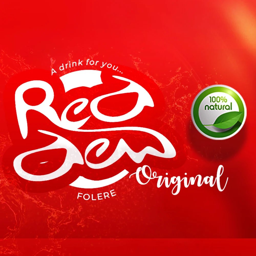
RedDew nature visual
THE NATURAL CORE 01
NATURE / MATERIAL

Nature becomes a visual material rather than a supporting idea.
02 PRODUCT PERSONALITY
04 / 03
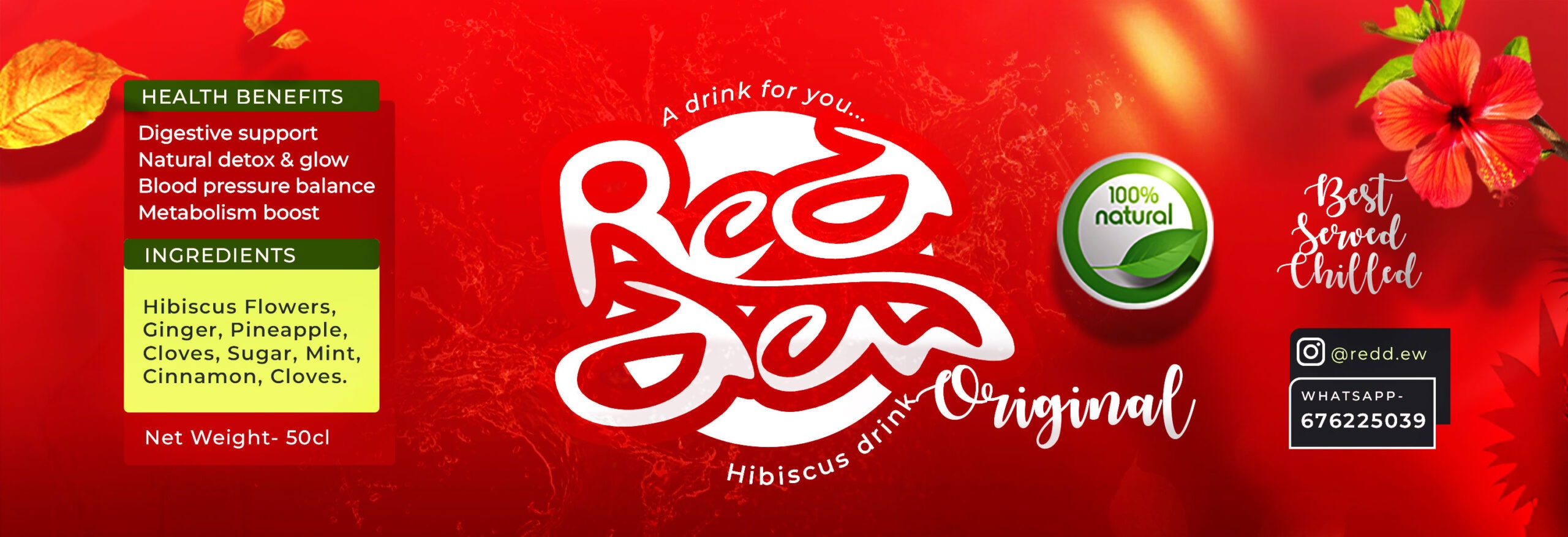
RedDew product personality
THE PRODUCT SPEAKS 02
PRODUCT / CHARACTER

Colour, composition and energy give the identity a recognizable presence.
REDDEW
VISUAL SYSTEM / 04
03 / PRODUCT / COMMUNICATION APPLICATION
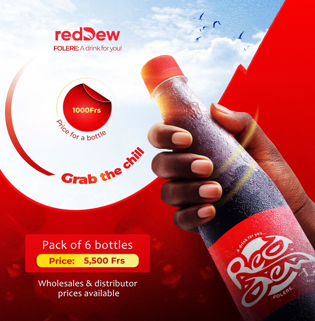
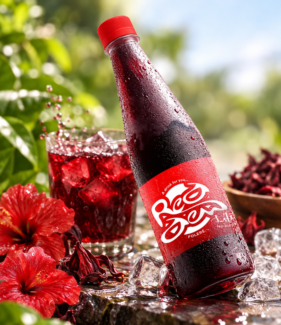
RedDew product communication
03 VISUAL SYSTEM
THE SYSTEM IN USE

The identity holds together across different visual expressions, without losing its character.

THE EXPRESSION 04.04
FROM A MARK TO A PRESENCE

The identity becomes more than a logo.

It becomes a visual presence that can move, communicate and live beyond the original mark.
NEXT 05 / THE PACKAGING
05
RedDew hibiscus beverage packaging
05 THE PACKAGING
REDDEW / PRODUCT EXPERIENCE
PACKAGING / 05.00

DESIGNED TO BE FELT.

Identity translated into a bottle designed to be noticed, held and remembered.

THE PRODUCT IDENTITY → OBJECT
REDDEW HIBISCUS / NATURAL / EXPRESSIVE
PACKAGING / 01
IDENTITY → PHYSICAL EXPERIENCE
THE MARK BECOMES
SOMETHING YOU CAN HOLD.
CONTINUE 06
NEXT 06 APPLICATIONS
06
06 THE APPLICATIONS
IDENTITY / IN MOTION
BEYOND THE BOTTLE

BUILT TO
LIVE.

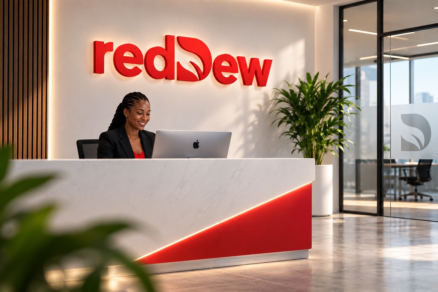
The identity moves naturally from product into experience and environment.
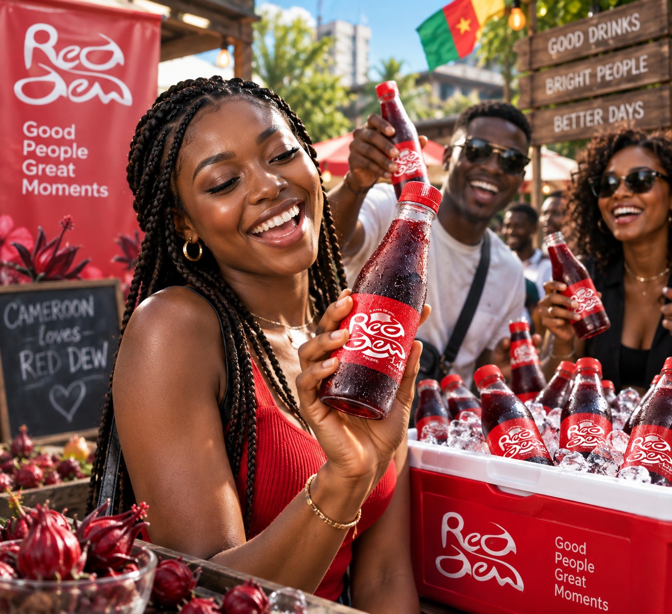
RedDew application
01 / 02 EXPERIENCE
IDENTITY → EXPERIENCE

MADE
TO BE
FELT.

REDDEW / APPLICATION
FROM PRODUCT
TO PRESENCE.
RedDew brand environment
02 / 02 ENVIRONMENT
IDENTITY → PLACE

BUILT
TO BE
SEEN.

REDDEW / APPLICATION 02
THE RESULT

ONE
IDENTITY.
MANY MOMENTS.

Designed to remain unmistakably RedDew, wherever it appears.

07
07 THE FINALE
NATURE / MADE DISTINCTIVE

ROOTED
IN NATURE.

A natural identity, given a presence as distinctive as the product itself.

REDDEW / BRAND IDENTITY 2026
END OF CASE STUDY
BACK TO PORTFOLIO
Scroll to Top