01
Direction One
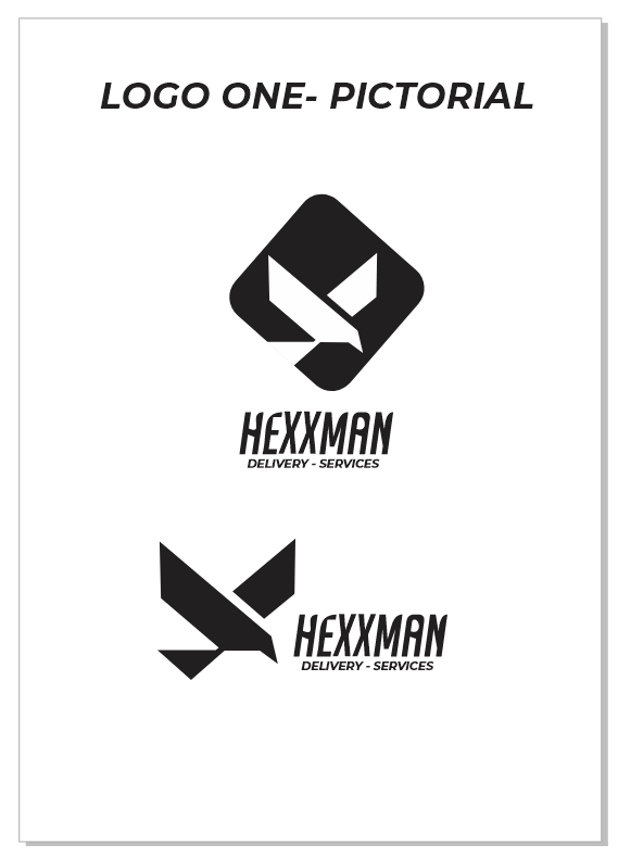
Structure
Geometric and engineered, with a strong emblematic presence.

A delivery identity engineered around speed, reliability and efficient movement.
The identity began with three distinct visual routes — each exploring a different interpretation of movement, delivery and the Hexxman name.
Geometric and engineered, with a strong emblematic presence.
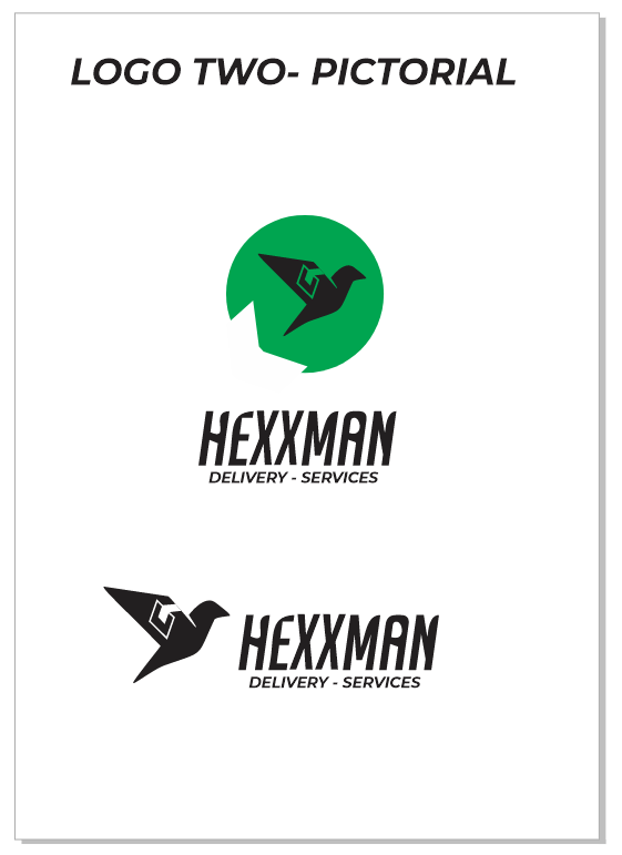
The clearest relationship between the bird, speed and the delivery promise.
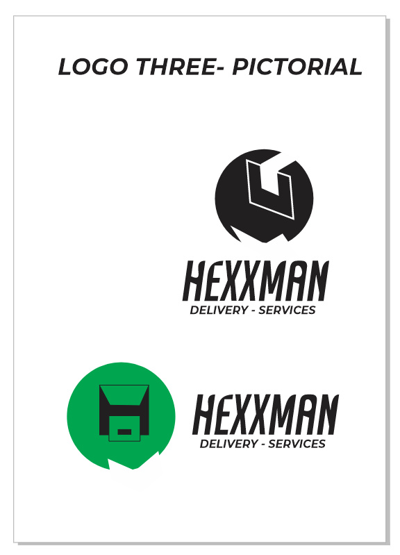
A more abstract emblem exploring recognition and visual ownership.
Direction Two gave Hexxman more than a recognisable bird. It created a visual structure with movement, ownership and forward energy built directly into the mark.
A strike posture angled upward and forward, turning the bird into a visual expression of proactive delivery.
A custom geometric H is integrated directly into the wing, creating a subtle signature of the Hexxman name.
The interrupted circular enclosure creates a jagged negative space that suggests the exhaust flare of a power bike or rocket.


The circular enclosure is deliberately interrupted by a sharp, jagged negative space. It behaves like the exhaust flare of a rocket or a power bike — giving the identity a visual sense of thrust.
The interruption breaks the static circle and makes the mark feel like it is accelerating.
The sharp exhaust-like geometry introduces force, power and forward pressure.
The flare becomes a proprietary visual device that can live beyond the logo itself.

NOT A DECORATION. A MOTION DEVICE.
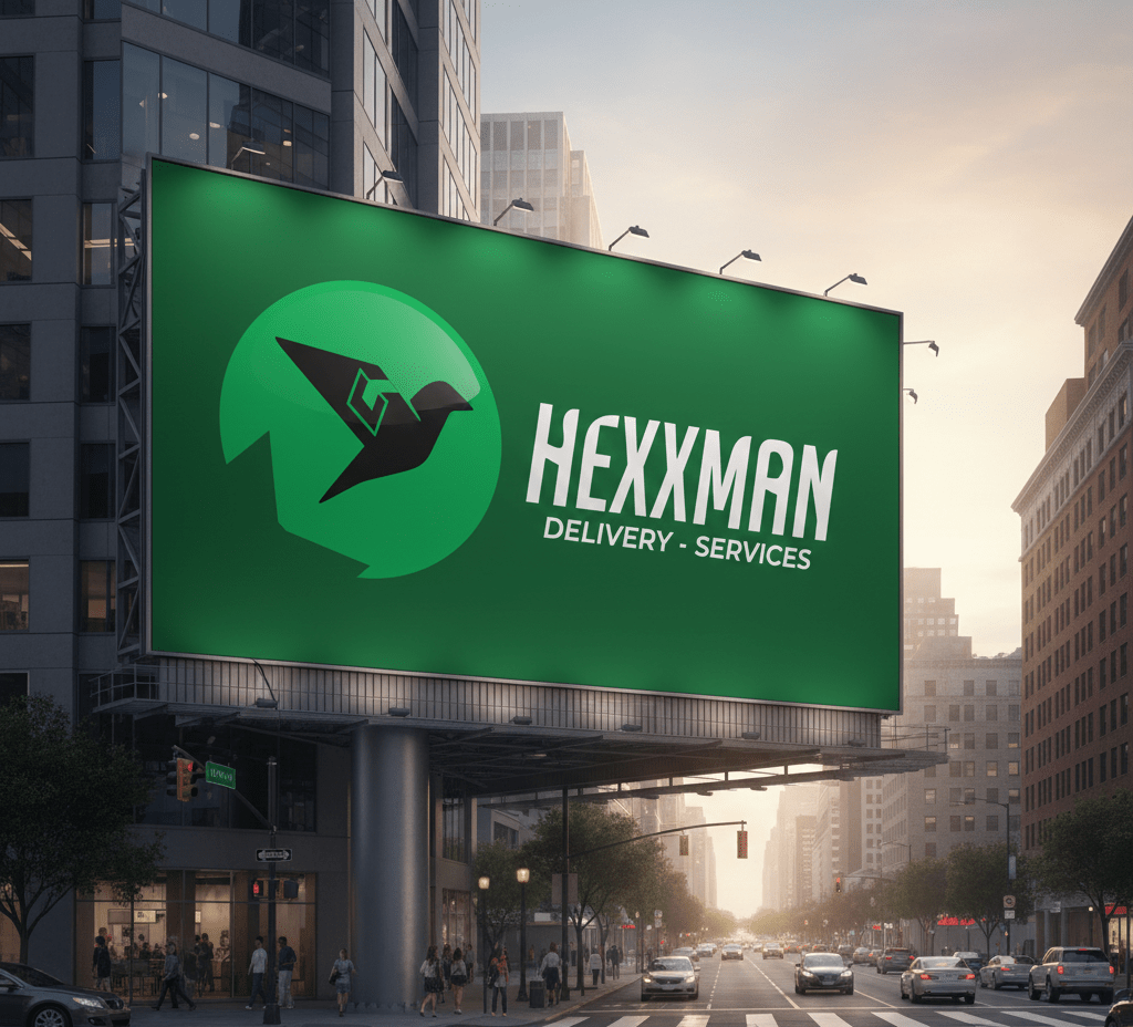
Hexxman Delivery / Architecture of SpeedThe identity was built to survive real-world movement: vehicles, billboards, motorcycles, digital interfaces and customer-facing environments — with high contrast and instant recognition.
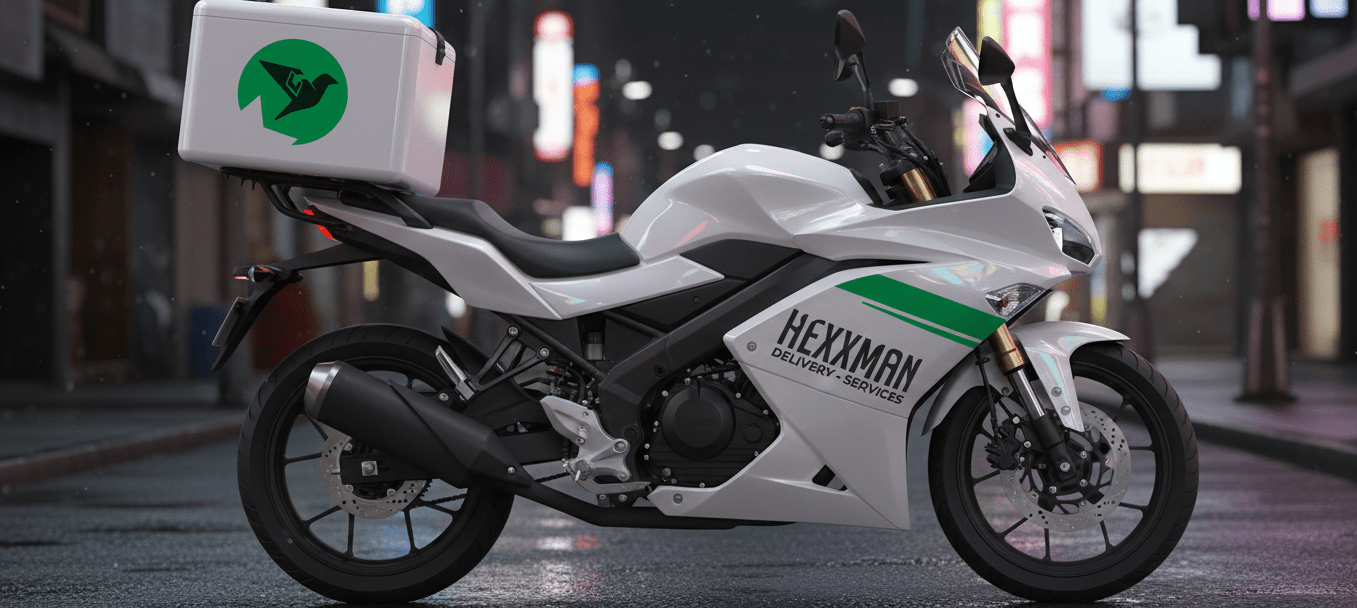

07 / The system
Identity / Applications / Recognition
The Hexxman identity was designed as a system rather than a single logo. The core mark can shift in scale, colour, context and application while keeping its distinctive movement, geometry and visual centre.
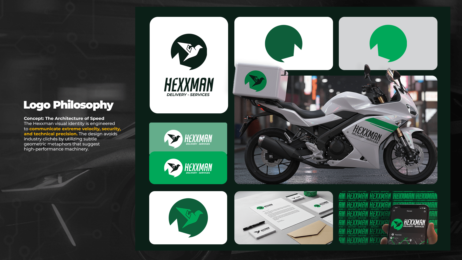
The bird, H construction and Power Flare remain recognisable even when the identity changes scale or application.
The system moves naturally from fleet graphics and stationery to digital environments and large-format communication.
Different expressions still feel unmistakably Hexxman because the same visual DNA holds the system together.
08 / The result
Identity / Strategy / Motion
Hexxman moves beyond the expected language of logistics. The result is an identity built around speed, ownership and forward energy — distinctive enough to be remembered, flexible enough to move across the entire business.
A pictorial mark with enough character to stand apart from conventional delivery identities.
The custom H, strike posture and Power Flare create visual assets that belong specifically to Hexxman.
From a moving motorcycle to a billboard, screen, package or future digital product, the system keeps its identity intact.
HEXXMAN / GIFTEDNUEL
A delivery identity engineered to be seen, recognised and remembered — wherever the business goes next.
BACK TO SELECTED WORK ↗